Traditional news
Credibility, attribution, and hierarchy. I kept the verified sourcing and cut the density.
AI-powered news, one story at a time
Product Designer
6-week sprint , 2025
Team 11:59 (HCAI cohort for Testing)
Product DesignProduct Strategy Prototyping
OVERVIEW
As a solo Product Designer, my goal was to take it from competitive research to a validated high-fidelity prototype, and built the AI model behind its personalization in 6 weeks.
Build an AI research pipeline to automate competitive analysis across news, social, and dating apps.
Run weekly testing with an HCAI cohort, one flow per week, against rebuilt competitor baselines and iterate based on user feedback.
Continuously iterating on the concepts and validating product decisions.
PROBLEM
Modern news interfaces are tuned for volume, not clarity, so staying informed quietly turns into work.
People either doom-scroll past everything or give up and disengage.
This isn't a content problem, it's a design problem. The information exists, the delivery just ignores how people want to receive it.
PAIN POINTS
Modern news interfaces are tuned for volume, not clarity, so staying informed quietly turns into work.
People either doom-scroll past everything or give up and disengage.
Long-form is the only option, so a reader who wants the gist still has to skim 1,200 words to find it.
The gap wasn't "better news," it was a different way to consume it: closer to how people already scroll TikTok and Reels.
Call out a feature, benefit, or value of your site, then link to a page where people can learn more about it.
OPPORTUNITY
TikTok proved one-thing-at-a-time full-screen consumption is effortless and dating apps proved gestures can teach an algorithm without a settings page, so borrow both, add credible sourcing and AI summarization, and news can feel as easy as Reels while actually keeping you informed.
One story at a time, full-bleed, zero clutter.
The AI learns from how you read, so preferences emerge from use, not setup.
Narrative or bullets, toggled on the fly: same story, your way.
SOLUTION
A mobile app that serves AI-summarized news one story at a time, full-screen, with a TikTok-style action rail for quick reactions.
Toggle between narrative and bullet reading modes, adjust text size, and browse by category, all without leaving the main flow.
A summarization model (prototyped in Google Colab on a custom dataset) writes the summaries, and the personalization layer learns from your reading behavior.
CORE FLOWS
Full-bleed, one story at a time, with category tabs up top and an action rail on the right. Every story is a real AI summary, not a truncated article.
Authentication plus one topic signal for the AI. That's the whole thing.
The tutorial dissolved into the first run, so people learn the app by touching it, not by reading about it.
Narrative for context, bullets for speed, switched with a single tap.
Two options, Small and Large, inspired by the Apple News control testers explicitly loved.
RESEARCH
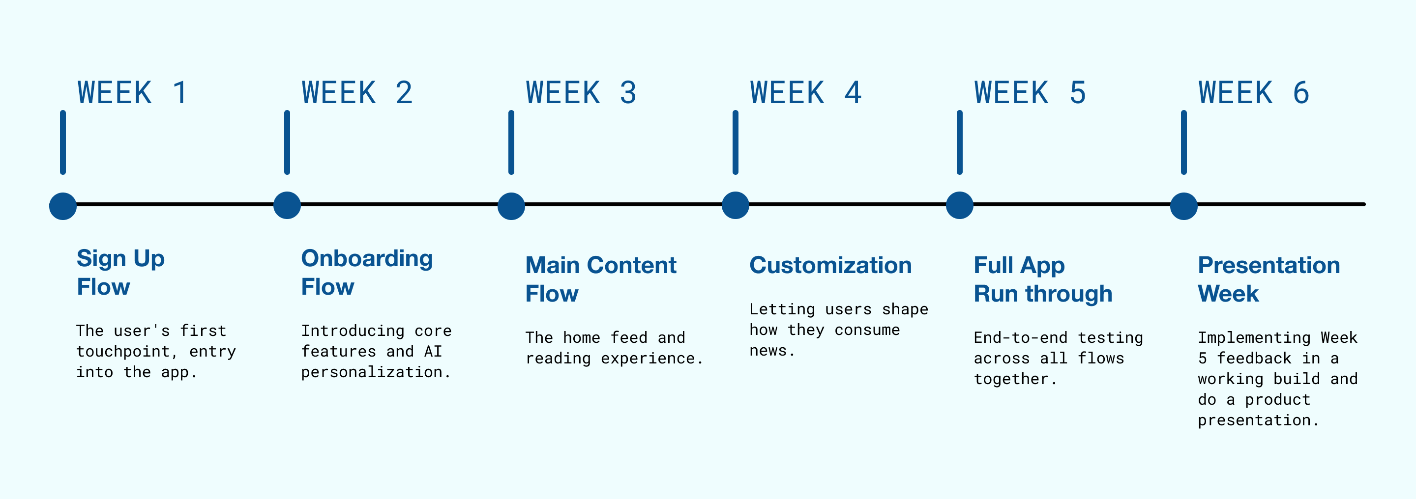
Glide ran on a flow-by-flow weekly rhythm with an HCI cohort, so every part of the app got its own research, design, and validation before the next.
To keep that research consistent week to week, I put together a small UX Competitor Audit skill, an agentic workflow chaining Chrome (Google DevTools MCP), Mobbin, and Figma MCP.

I'd hand it a vague prompt ("look at sign-up flows for news apps") and it scoped the landscape, walked the relevant Mobbin flows, and set up a Figma workspace ready to prototype against.
A 2 to 3 day research task came down to a few hours, with broader coverage.
Note: Mobbin has since shipped its own MCP server, which now does most of what my skill did. Mine was an early version of what's becoming a common AI-native research pattern.
Rather than benchmark only against other news apps, I used the pipeline to study three categories, each one solving a problem Glide also had.
Credibility, attribution, and hierarchy. I kept the verified sourcing and cut the density.
Full-screen content and vertical action rails, which became the strongest candidate for the main flow.
Content isolation and swipe-to-prefer, a natural way for the AI to learn what people liked.
Mapping all three on feed model and personalization showed the gap. News sat in the dense, manual corner while the effortless patterns lived in the opposite one, so I carried a credible news product into that corner.
DESIGN PROCESS
Each week of the cohort cycle took one flow. I walked in with a starting design, tested it, and let the feedback decide what changed. When multiple patterns seemed right, I built them and let users pick instead of guessing.
The actual sign-up flows from competitor apps, put in front of testers to see how they felt about the longer, multi-screen flows.
Every field that didn't authenticate or give the AI a first topic signal was noise, so I cut it to two screens.
Testers moved through both screens without friction and never went hunting for the extra steps other apps front-load.
A dedicated multi-screen tutorial that taught the app before letting anyone use it.
Testers kept reaching for the product instead of reading tooltips, so I dissolved the tutorial into a 6-screen first run and let features surface in context.
People consistently tapped straight into the app rather than sit through instruction, so contextual discovery matched how they already behaved.
The H1 main flow, a slimmed multi-section feed of topics, headlines, and article cards.
Even reduced, H1 felt heavy, so after studying Reels and TikTok I rebuilt it as H2: one story at a time, full-bleed, with a vertical action rail. When swipe-to-like (the dating pattern) and TikTok-style tabs both seemed viable, I built both and tested them.
Tabs and explicit buttons felt more predictable while swipes added cognitive load, so the TikTok pattern won and swipe was cut.
Two real needs surfaced, reading style (narrative versus bullets) and text size (Small versus Large, inspired by the Apple News control testers loved), and I kept the surface deliberately small.
End-to-end testing held up with no major breaks, and feedback shifted to polish like animations and transitions, which were build problems, not design problems
I moved the prototype into a working Xcode build with Cursor using SwiftUI and react native so interaction feedback could be tested in a real runtime.
Across the full run-through, the recurring theme was how light it felt to get through the news, with the short-form flow, the reading toggle, and the small customization surface working together.
"It doesn't feel like a news app, it feels like something I actually want to open."
HCI cohort tester, Week 6
I didn't realize how much news fatigue I had until I tried this."
HCI cohort tester, Week 5
"The only thing I kept wishing for was being able to just listen to it on my commute."
HCI cohort tester, Week 6

AI-powered news, one story at a time
Product Designer
6-week sprint , 2025
Team 11:59 (HCAI cohort for Testing)
Product DesignProduct Strategy Prototyping
OVERVIEW
As a solo Product Designer, my goal was to take it from competitive research to a validated high-fidelity prototype, and built the AI model behind its personalization in 6 weeks.
Build an AI research pipeline to automate competitive analysis across news, social, and dating apps.
Run weekly testing with an HCAI cohort, one flow per week, against rebuilt competitor baselines and iterate based on user feedback.
Continuously iterating on the concepts and validating product decisions.
PROBLEM
Modern news interfaces are tuned for volume, not clarity, so staying informed quietly turns into work.
People either doom-scroll past everything or give up and disengage.
This isn't a content problem, it's a design problem. The information exists, the delivery just ignores how people want to receive it.
PAIN POINTS
Modern news interfaces are tuned for volume, not clarity, so staying informed quietly turns into work.
People either doom-scroll past everything or give up and disengage.
Long-form is the only option, so a reader who wants the gist still has to skim 1,200 words to find it.
The gap wasn't "better news," it was a different way to consume it: closer to how people already scroll TikTok and Reels.
Call out a feature, benefit, or value of your site, then link to a page where people can learn more about it.
OPPORTUNITY
TikTok proved one-thing-at-a-time full-screen consumption is effortless and dating apps proved gestures can teach an algorithm without a settings page, so borrow both, add credible sourcing and AI summarization, and news can feel as easy as Reels while actually keeping you informed.
One story at a time, full-bleed, zero clutter.
The AI learns from how you read, so preferences emerge from use, not setup.
Narrative or bullets, toggled on the fly: same story, your way.
SOLUTION
A mobile app that serves AI-summarized news one story at a time, full-screen, with a TikTok-style action rail for quick reactions.
Toggle between narrative and bullet reading modes, adjust text size, and browse by category, all without leaving the main flow.
A summarization model (prototyped in Google Colab on a custom dataset) writes the summaries, and the personalization layer learns from your reading behavior.
CORE FLOWS
Full-bleed, one story at a time, with category tabs up top and an action rail on the right. Every story is a real AI summary, not a truncated article.
Authentication plus one topic signal for the AI. That's the whole thing.
The tutorial dissolved into the first run, so people learn the app by touching it, not by reading about it.
Narrative for context, bullets for speed, switched with a single tap.
Two options, Small and Large, inspired by the Apple News control testers explicitly loved.
RESEARCH
Glide ran on a flow-by-flow weekly rhythm with an HCI cohort, so every part of the app got its own research, design, and validation before the next.
To keep that research consistent week to week, I put together a small UX Competitor Audit skill, an agentic workflow chaining Chrome (Google DevTools MCP), Mobbin, and Figma MCP.
I'd hand it a vague prompt ("look at sign-up flows for news apps") and it scoped the landscape, walked the relevant Mobbin flows, and set up a Figma workspace ready to prototype against.
A 2 to 3 day research task came down to a few hours, with broader coverage.
Note: Mobbin has since shipped its own MCP server, which now does most of what my skill did. Mine was an early version of what's becoming a common AI-native research pattern.
Rather than benchmark only against other news apps, I used the pipeline to study three categories, each one solving a problem Glide also had.
Credibility, attribution, and hierarchy. I kept the verified sourcing and cut the density.
Full-screen content and vertical action rails, which became the strongest candidate for the main flow.
Content isolation and swipe-to-prefer, a natural way for the AI to learn what people liked.
Mapping all three on feed model and personalization showed the gap. News sat in the dense, manual corner while the effortless patterns lived in the opposite one, so I carried a credible news product into that corner.
DESIGN PROCESS
Each week of the cohort cycle took one flow. I walked in with a starting design, tested it, and let the feedback decide what changed. When multiple patterns seemed right, I built them and let users pick instead of guessing.
The actual sign-up flows from competitor apps, put in front of testers to see how they felt about the longer, multi-screen flows.
Every field that didn't authenticate or give the AI a first topic signal was noise, so I cut it to two screens.
Testers moved through both screens without friction and never went hunting for the extra steps other apps front-load.
A dedicated multi-screen tutorial that taught the app before letting anyone use it.
Testers kept reaching for the product instead of reading tooltips, so I dissolved the tutorial into a 6-screen first run and let features surface in context.
People consistently tapped straight into the app rather than sit through instruction, so contextual discovery matched how they already behaved.
The H1 main flow, a slimmed multi-section feed of topics, headlines, and article cards.
Even reduced, H1 felt heavy, so after studying Reels and TikTok I rebuilt it as H2: one story at a time, full-bleed, with a vertical action rail. When swipe-to-like (the dating pattern) and TikTok-style tabs both seemed viable, I built both and tested them.
Tabs and explicit buttons felt more predictable while swipes added cognitive load, so the TikTok pattern won and swipe was cut.
Two real needs surfaced, reading style (narrative versus bullets) and text size (Small versus Large, inspired by the Apple News control testers loved), and I kept the surface deliberately small.
End-to-end testing held up with no major breaks, and feedback shifted to polish like animations and transitions, which were build problems, not design problems
I moved the prototype into a working Xcode build with Cursor using SwiftUI and react native so interaction feedback could be tested in a real runtime.
Across the full run-through, the recurring theme was how light it felt to get through the news, with the short-form flow, the reading toggle, and the small customization surface working together.
"It doesn't feel like a news app, it feels like something I actually want to open."
HCI cohort tester, Week 6
I didn't realize how much news fatigue I had until I tried this."
HCI cohort tester, Week 5
"The only thing I kept wishing for was being able to just listen to it on my commute."
HCI cohort tester, Week 6
AI-powered news, one story at a time
Product Designer
6-week sprint , 2025
Team 11:59 (HCAI cohort for Testing)
Product DesignProduct Strategy Prototyping
OVERVIEW
As a solo Product Designer, my goal was to take it from competitive research to a validated high-fidelity prototype, and built the AI model behind its personalization in 6 weeks.
Build an AI research pipeline to automate competitive analysis across news, social, and dating apps.
Run weekly testing with an HCAI cohort, one flow per week, against rebuilt competitor baselines and iterate based on user feedback.
Continuously iterating on the concepts and validating product decisions.
PROBLEM
Modern news interfaces are tuned for volume, not clarity, so staying informed quietly turns into work.
People either doom-scroll past everything or give up and disengage.
This isn't a content problem, it's a design problem. The information exists, the delivery just ignores how people want to receive it.
PAIN POINTS
Modern news interfaces are tuned for volume, not clarity, so staying informed quietly turns into work.
People either doom-scroll past everything or give up and disengage.
Long-form is the only option, so a reader who wants the gist still has to skim 1,200 words to find it.
The gap wasn't "better news," it was a different way to consume it: closer to how people already scroll TikTok and Reels.
Call out a feature, benefit, or value of your site, then link to a page where people can learn more about it.
OPPORTUNITY
TikTok proved one-thing-at-a-time full-screen consumption is effortless and dating apps proved gestures can teach an algorithm without a settings page, so borrow both, add credible sourcing and AI summarization, and news can feel as easy as Reels while actually keeping you informed.
One story at a time, full-bleed, zero clutter.
The AI learns from how you read, so preferences emerge from use, not setup.
Narrative or bullets, toggled on the fly: same story, your way.
SOLUTION
A mobile app that serves AI-summarized news one story at a time, full-screen, with a TikTok-style action rail for quick reactions.
Toggle between narrative and bullet reading modes, adjust text size, and browse by category, all without leaving the main flow.
A summarization model (prototyped in Google Colab on a custom dataset) writes the summaries, and the personalization layer learns from your reading behavior.
CORE FLOWS
Full-bleed, one story at a time, with category tabs up top and an action rail on the right. Every story is a real AI summary, not a truncated article.
Authentication plus one topic signal for the AI. That's the whole thing.
The tutorial dissolved into the first run, so people learn the app by touching it, not by reading about it.
Narrative for context, bullets for speed, switched with a single tap.
Two options, Small and Large, inspired by the Apple News control testers explicitly loved.
RESEARCH
Glide ran on a flow-by-flow weekly rhythm with an HCI cohort, so every part of the app got its own research, design, and validation before the next.
To keep that research consistent week to week, I put together a small UX Competitor Audit skill, an agentic workflow chaining Chrome (Google DevTools MCP), Mobbin, and Figma MCP.
I'd hand it a vague prompt ("look at sign-up flows for news apps") and it scoped the landscape, walked the relevant Mobbin flows, and set up a Figma workspace ready to prototype against.
A 2 to 3 day research task came down to a few hours, with broader coverage.
Note: Mobbin has since shipped its own MCP server, which now does most of what my skill did. Mine was an early version of what's becoming a common AI-native research pattern.
Rather than benchmark only against other news apps, I used the pipeline to study three categories, each one solving a problem Glide also had.
Credibility, attribution, and hierarchy. I kept the verified sourcing and cut the density.
Full-screen content and vertical action rails, which became the strongest candidate for the main flow.
Content isolation and swipe-to-prefer, a natural way for the AI to learn what people liked.
Mapping all three on feed model and personalization showed the gap. News sat in the dense, manual corner while the effortless patterns lived in the opposite one, so I carried a credible news product into that corner.
DESIGN PROCESS
Each week of the cohort cycle took one flow. I walked in with a starting design, tested it, and let the feedback decide what changed. When multiple patterns seemed right, I built them and let users pick instead of guessing.
The actual sign-up flows from competitor apps, put in front of testers to see how they felt about the longer, multi-screen flows.
Every field that didn't authenticate or give the AI a first topic signal was noise, so I cut it to two screens.
Testers moved through both screens without friction and never went hunting for the extra steps other apps front-load.
A dedicated multi-screen tutorial that taught the app before letting anyone use it.
Testers kept reaching for the product instead of reading tooltips, so I dissolved the tutorial into a 6-screen first run and let features surface in context.
People consistently tapped straight into the app rather than sit through instruction, so contextual discovery matched how they already behaved.
The H1 main flow, a slimmed multi-section feed of topics, headlines, and article cards.
Even reduced, H1 felt heavy, so after studying Reels and TikTok I rebuilt it as H2: one story at a time, full-bleed, with a vertical action rail. When swipe-to-like (the dating pattern) and TikTok-style tabs both seemed viable, I built both and tested them.
Tabs and explicit buttons felt more predictable while swipes added cognitive load, so the TikTok pattern won and swipe was cut.
Two real needs surfaced, reading style (narrative versus bullets) and text size (Small versus Large, inspired by the Apple News control testers loved), and I kept the surface deliberately small.
End-to-end testing held up with no major breaks, and feedback shifted to polish like animations and transitions, which were build problems, not design problems
I moved the prototype into a working Xcode build with Cursor using SwiftUI and react native so interaction feedback could be tested in a real runtime.
Across the full run-through, the recurring theme was how light it felt to get through the news, with the short-form flow, the reading toggle, and the small customization surface working together.
"It doesn't feel like a news app, it feels like something I actually want to open."
HCI cohort tester, Week 6
I didn't realize how much news fatigue I had until I tried this."
HCI cohort tester, Week 5
"The only thing I kept wishing for was being able to just listen to it on my commute."
HCI cohort tester, Week 6